
LINK MJO WEEKLY UPDATE (PPT) ( <----- KLIK SAJA)
LINK MJO WEEKLY UPDATE (PDF) ( <----- KLIK SAJA)
40 Hari
90 Hari
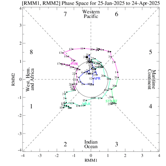
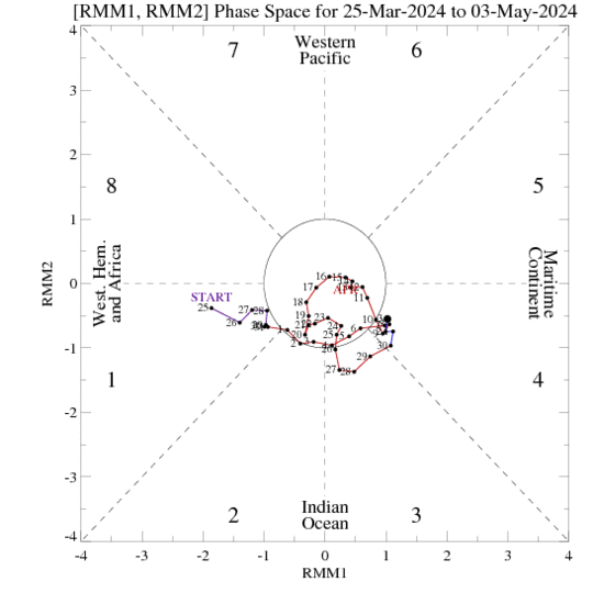
Phase diagrams for the last 40 (top) and 90 days (bottom) illustrating the phase and amplitude of the MJO based on the principal component time series of the leading two EOFs from a combined EOF analysis using 850 hPa zonal wind, 200 hPa zonal wind and OLR. Counter-clockwise movement around the diagram indicates an eastward propagating signal across eight phases from the Indian Ocean to the Pacific and later the western hemisphere. Color of lines distinguish different months and dates are annotated. The farther away from the center of the circle the stronger the MJO signal.
MJO forecast
Shown below are MJO forecast products using information from the ensemble GFS. The Wheeler and Hendon (2004) methodology is applied to the model forecast data and are equivalent to those perfomed on observations with necessary adjustments due to the use of realtime model forecast data. These include utilizing bias-corrected fields. Please inquire for additional details if needed. The anomalies (with the seasonal cycle and interannual variability removed) are then projected onto EOFs based on observed data.
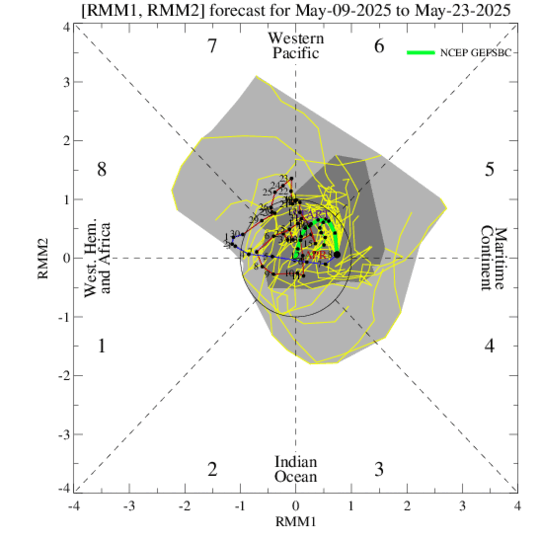
Phase diagram showing the evolution of the last 40 days of observations along with the 15 day ensemble GFS forecast. The yellow lines are the twenty ensemble members and the green line is the ensemble mean (thick-week 1, thin-week 2). The dark gray shading depicts 90% of the members fall in this area and the light gray shading indicates 50% of the members.
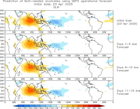
Forecast of MJO associated anomalous OLR for the next 15 days from the ensemble mean GFS based on forecasts of RMM1 and RMM2. Blue (yellow/red) shades show negative (positive) OLR anomalies and enhanced (suppressed) convection. Forecasts do not include direct contributions from other climate modes such as ENSO, monsoons, etc. - only the MJO.
Tidak ada komentar:
Posting Komentar